
Miramax Loved ‘The Holdovers’ ’70s-Style Logo Design So Much It Ended Up Using It on Other Releases

Director Alexander Payne’s “The Holdovers” roots itself in 1970s nostalgia, right down to the main title design and the studio logos.
However, neither company existed at the time. Distributor Focus Features was founded in 2002, while the film production company Miramax got started in 1979. Payne called on his go-to graphic designer Nate Carlson to develop ideas.
More from Variety
Having worked together dating back to 1999’s “Election,” Carlson was used to Payne’s requests. “He likes to do things that are very clean and simple,” Carlson says. When they looked at the current logos for both companies, the modern aesthetic didn’t quite work for the film’s period vibe. “So, I dialed it back,” he says.
Carlson dug into resources that chronicled the maturation of the animated movie logo. “They were quirky, clunky and out of focus,” Carlson says of the older logos.
He began by tackling the Miramax logo first choosing a looping animation style with a blue background and yellow letters. Carlson used the film’s color palette for inspiration as well as trying to stay period-accurate. He says, “The idea of a pure white didn’t exist because of how things were projected, so I had to find the right white and blue when I did use those colors.”
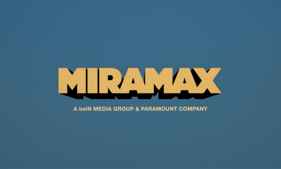
Carlson also used filters to help dial things back. But because everything back then was done on film stock, the color on the logos were brought down a few tones and had grain added to keep with that ‘70s aesthetic.
Miramax ended up liking Carlson’s logo design work so much, the company ended up using his title designs on subsequent releases including” Operation Fortune,” “Sick” and the upcoming “The Beekeeper.”

And then he had to work on the title card for “The Holdovers” itself, but keeping in line with Payne’s vision, he kept things clean and simple, but with a font of his own design.
The film is set at the fictional Barton Academy, a New England prep school, so Payne also needed Carlson to design a crest.
“There’s a bull, the tree of knowledge, there’s the regal lion and key,” Carlson explains. In the crest, Carlson created the bull with a pile of dung under him.
The Academy’s motto, Carlson says came from conversations with Payne. He says, “Alexander is a big stickler for correct Latin. So my idea of a motto got altered because he spoke to his old Latin buddies about how everything is meant to be rigid.” He adds, “The motto itself is something to the effect of ‘The tree of knowledge from the dunghill of ignorance.”
He ended up creating two versions. One, dating back to the 1800s reflects the history of the Academy, looking like “it was a hundred years old,” and an updated version.
Best of Variety
Sign up for Variety’s Newsletter. For the latest news, follow us on Facebook, Twitter, and Instagram.

