
How This Bathroom Went From Dark and Dated to Incredibly Airy
If you are exhausted with the current state of your bathroom or have been for years, your not-so-oasis is long overdue for a makeover. Whether you're talking with your contractor about committing to a complete makeover or daydreaming based on your Pinterest board, designing the bathroom of your dreams doesn't have to be so farfetched. Even if your budget doesn't allow for a head-to-toe transformation, changing at least one aspect of the space is a great place to start!
For anyone who has a general idea of what you want to update but doesn't know exactly what you want to do with it, these bathroom remodel ideas will give you serious inspiration. Yes, they're designer projects that you can pin to your vision board! The epic makeovers below will push you to add that vibrant wallpaper to your shopping cart, replace outdated countertops, switch up lighting fixtures, and even remove your bathtub completely for a sleek shower. When you are through admiring these spa-worthy bathroom transformations, you will feel at peace going forward knowing that your before and after process isn't impossible.
🏡Love finding new design tricks. So do we. Let us share the best of them.
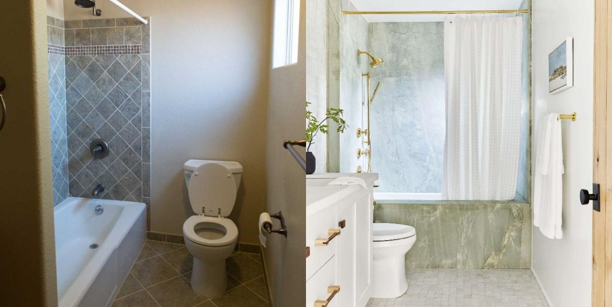
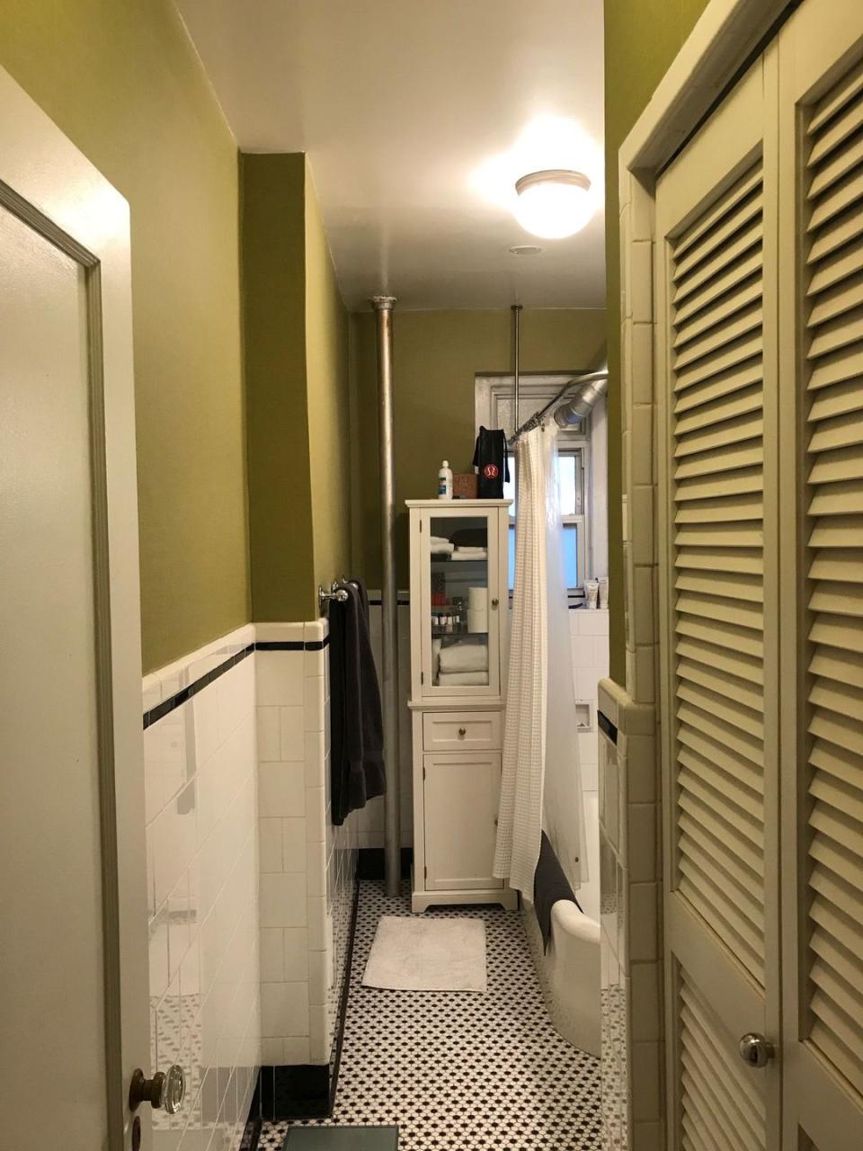
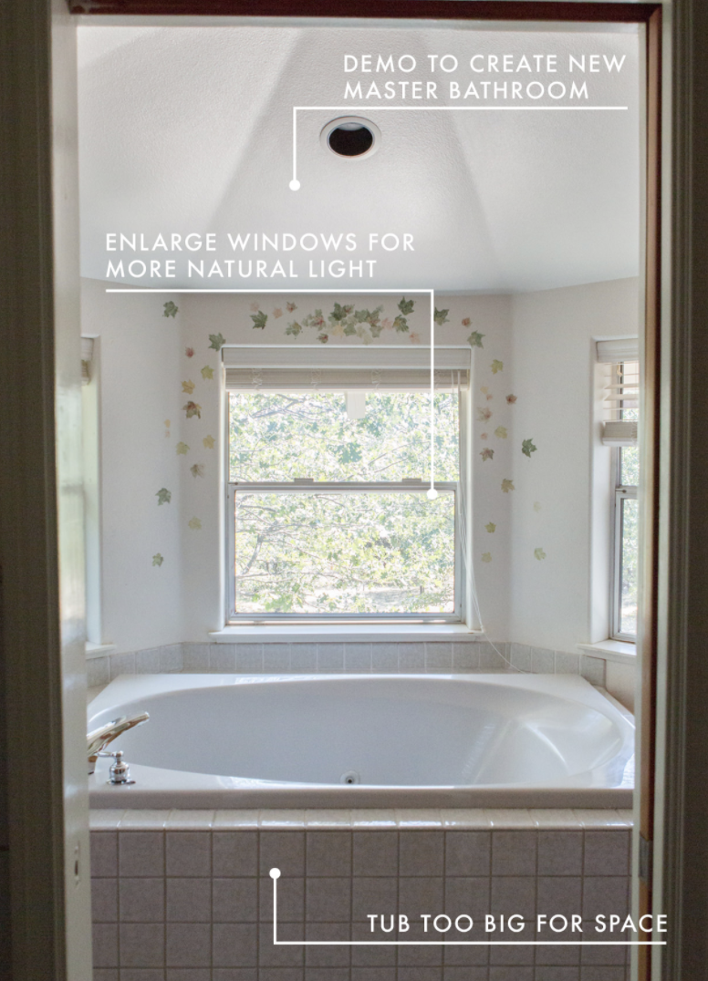
Before: Floor Layout
Everything about the floor plan of this bathroom screams awkward. It is tight and tiny, not reflecting the size of the home. The bathtub, shower, and toilet room are tucked away in front of the room's only window.
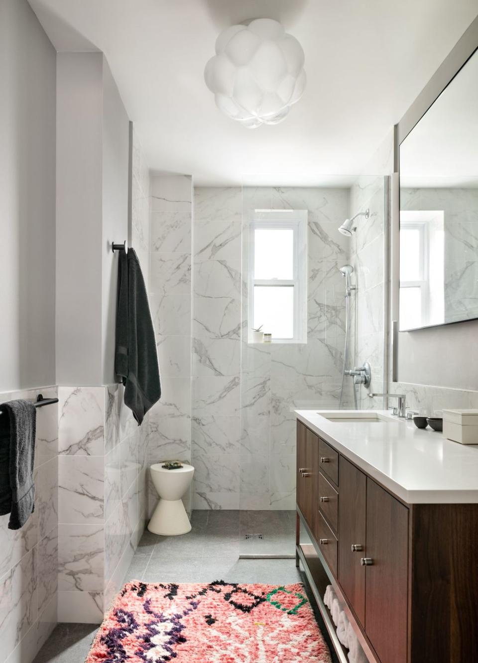
After: Floor Layout
To allude to more space, Katie Davis bucked the room's original layout so light pools in at every turn. "It immediately made the room feel bigger," recalls the designer. In addition, Davis borrowed square footage from the main closet to create a separate area for the toilet. "It feels so seamless now and not at all choppy," says the designer.
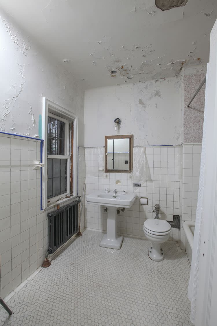
Before: Shower Makeover
With the few black and red tiles distributed throughout this otherwise, very white and colorless bathroom, the lack of impact in the space is evident. The tiny tub consumes the space in thie 4'10" x 5' 10" bathroom.
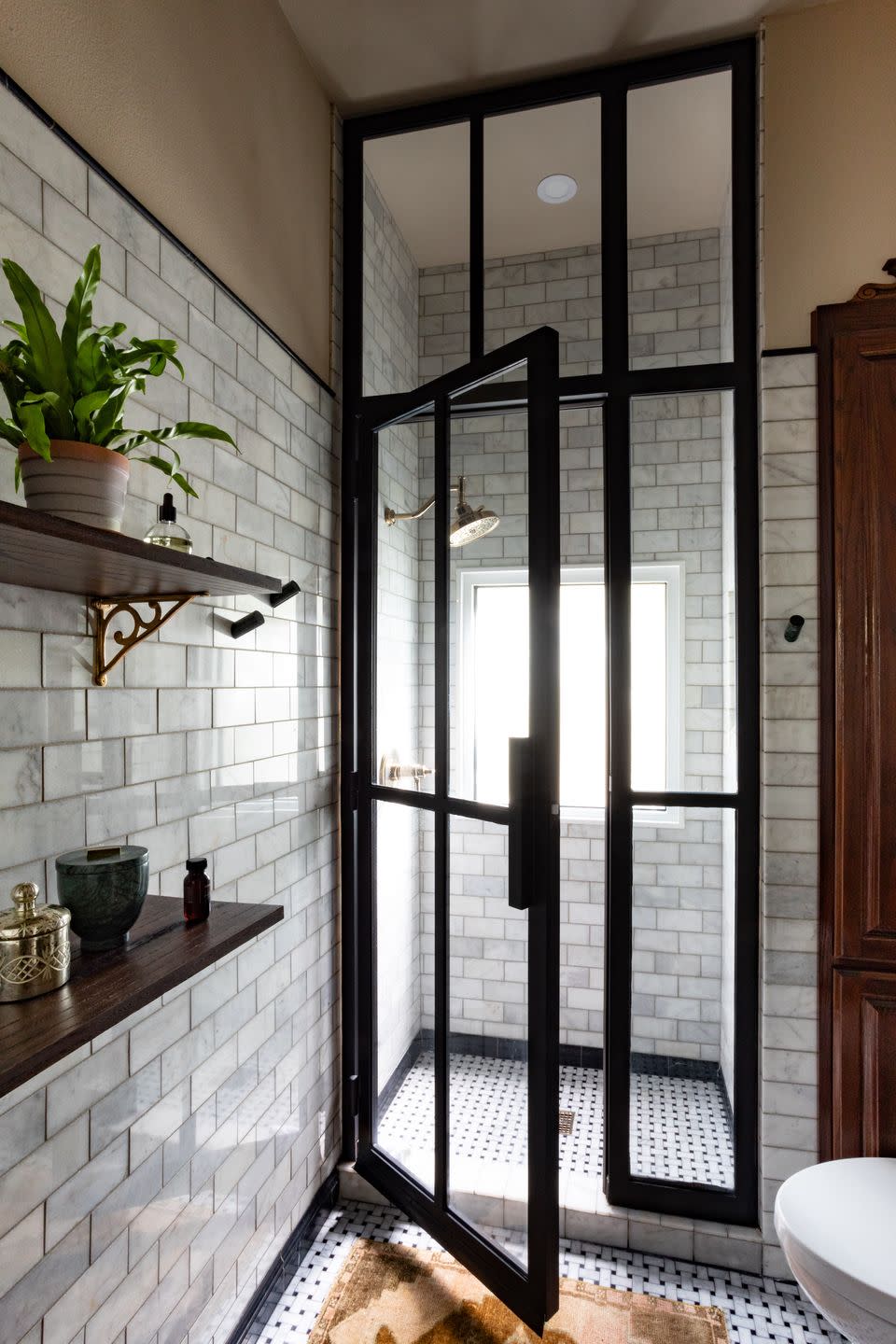
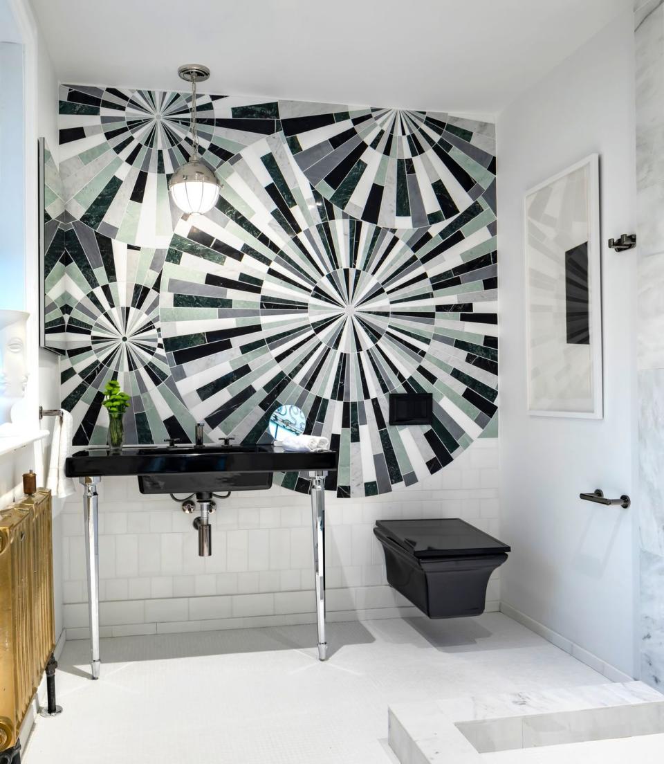
After: Shower Makeover
Since the prior model was the primary bath, Sarah Stacey expanded the footprint based on the client's love for twentieth-century design. The black details give the bathroom more depth, the floor-to-ceiling framed shower enclosure adds to the grand appeal and the black and white mosaic tile helps to unify and expand the room. To layer and elevate the space, she added a marble baseboard and pencil liner.
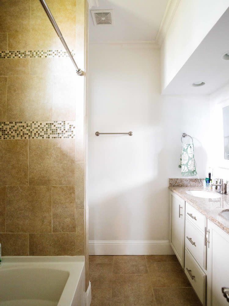
Before: Bathtub Install
This beige bathroom features more tile than we can count! The bulky jacuzzi tub not only takes up too much space but is a top destination for bacteria.

After: Bathtub Install
Melissa and Miller designed a spa-like bathroom that is peaceful enough to convince you that you're on vacation. Gone are the excessive tan tiles and marble lies in its stay instead. The warming towel rack, generously sized tub, and silver finishings will make your self-care routine feel like a reward.

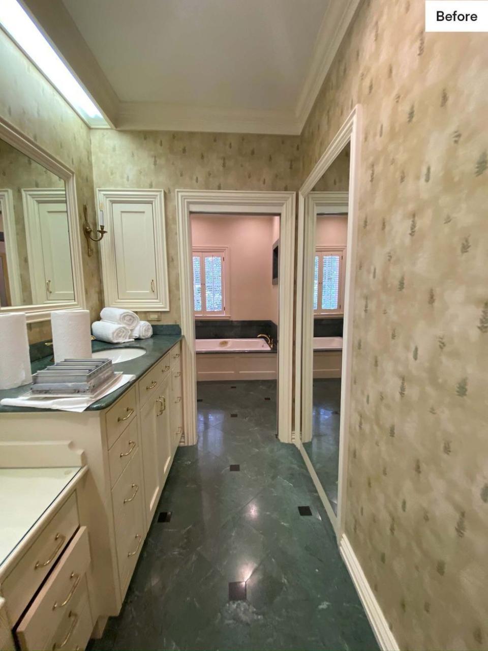
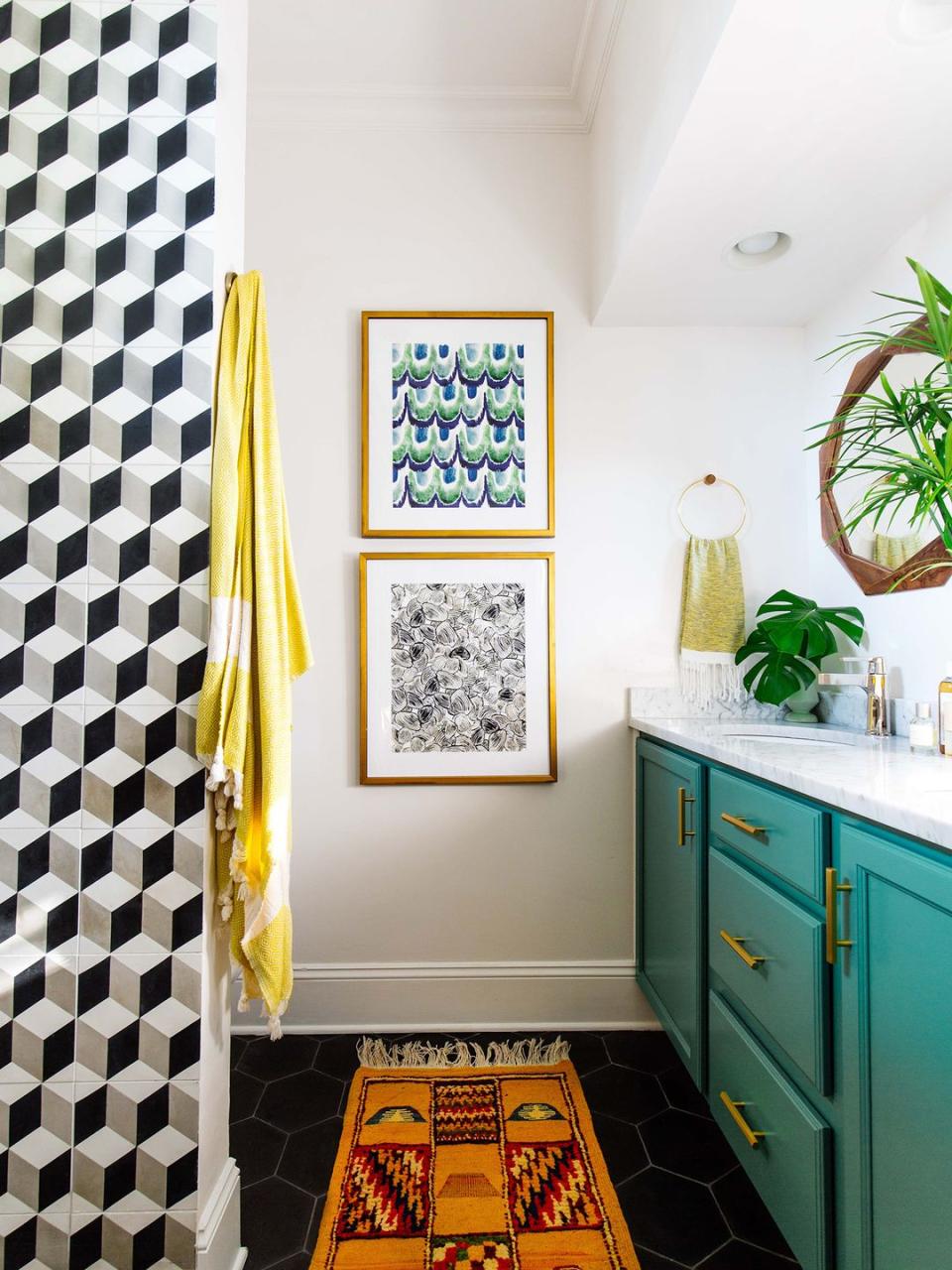
Before: Bathroom Walls
Avery Cox of Avery Cox Design

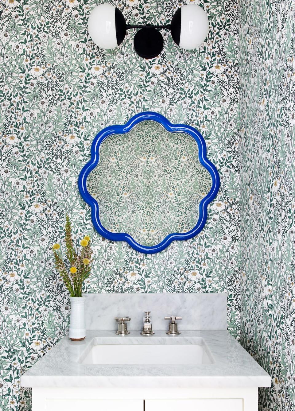
After: Bathroom Walls
The power of wallpaper can never be underestimated! Avery Cox of Avery Cox Design chose a green and blue wallpaper to freshen up the space and make it feel brighter. Cox chose a bright blue wavy mirror to anchor the design. It is a pop of color that compliments the floral wallpaper but still stands out. She also changed the sink from a pedestal sink to a minty allowing for more storage.
Before: Shower Location
This outdated bathroom originally had a bathtub and shower combo situated length-wise with limited vanity space next to it, making the room feel smaller as a whole.
After: Shower Location
With a simple shift in the tub and toilet area of this kids' bathroom, designer Emily Henderson freed up space for a double vanity and extra storage. Plus, she gave it a playful, contemporary look that makes the room bright and airy.
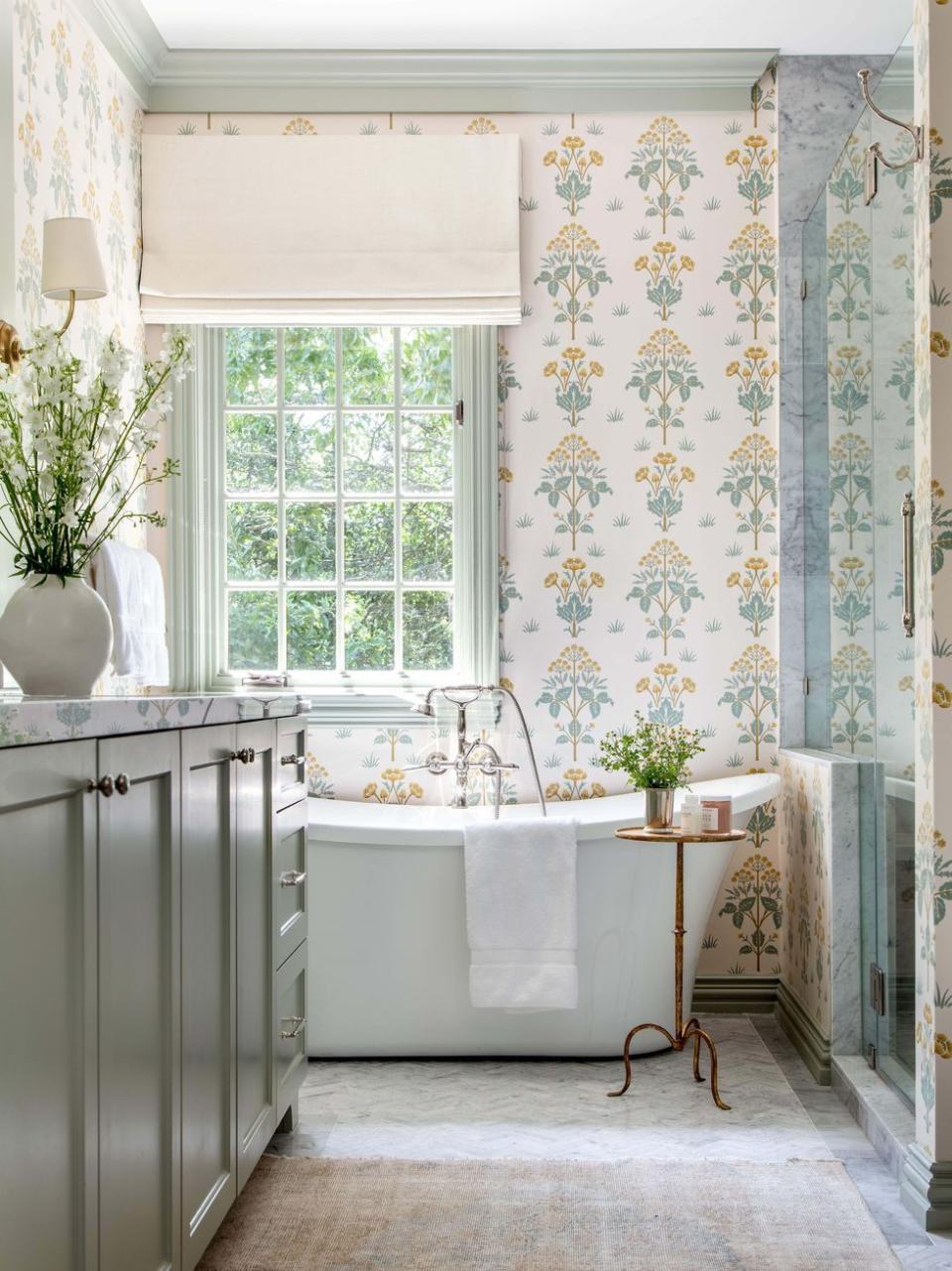
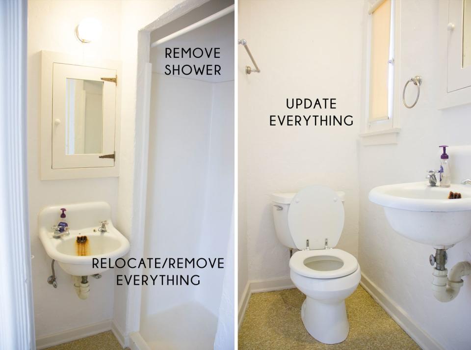
Before: Limited Space
This overly dark and narrow bathroom would make anyone feel claustrophobic...
After: Open Space
Designer Jamie Nesbitt-Weber razed the closet and replaced the old-fashioned tub with a sleek walk-in shower to make the room more spacious.
Before: Cabinet Color
These plain white cabinets are fine if you're not looking for anything that'll induce excitement. If you want to add flair, though, throwing some color on them will do the trick.
After: Cabinet Color
This bathroom designed by Old Brand New features bright teal cabinets with gold hardware. The vibrant color gives off a welcoming vibe that's hard to resist.
Before: Bathtub Placement
The awkwardly too-low location of this tub makes the space seem uneven and dated.
After: Bathtub Placement
Symmetry Designs replaced the old floor-embedded tub with a freestanding number that instantly gives the room a more modern look and feel.
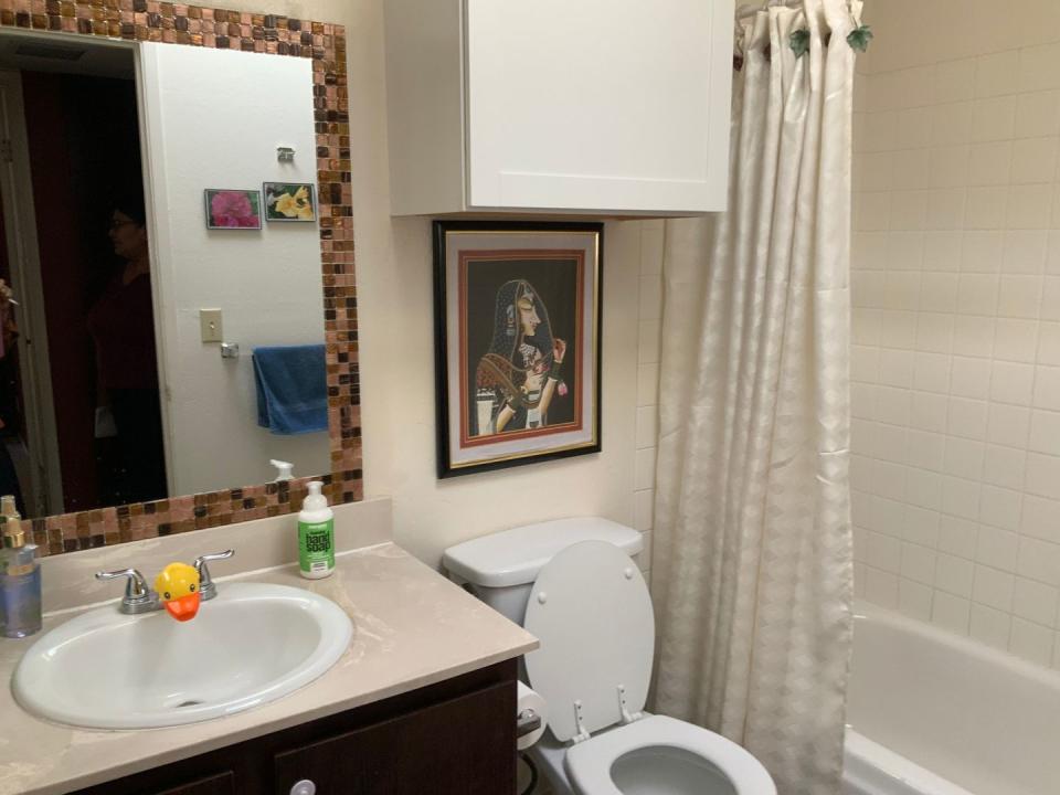
Before: Wall Decor
A clunky overhanging cabinet, random art, and dirty-white paint add up to a very drab look.
After: Wall Treatment
Dekorati Interiors founder Rati Mishra instantly elevated the room by removing the cabinet and covering up the wall with a soothing nature-inspired print.

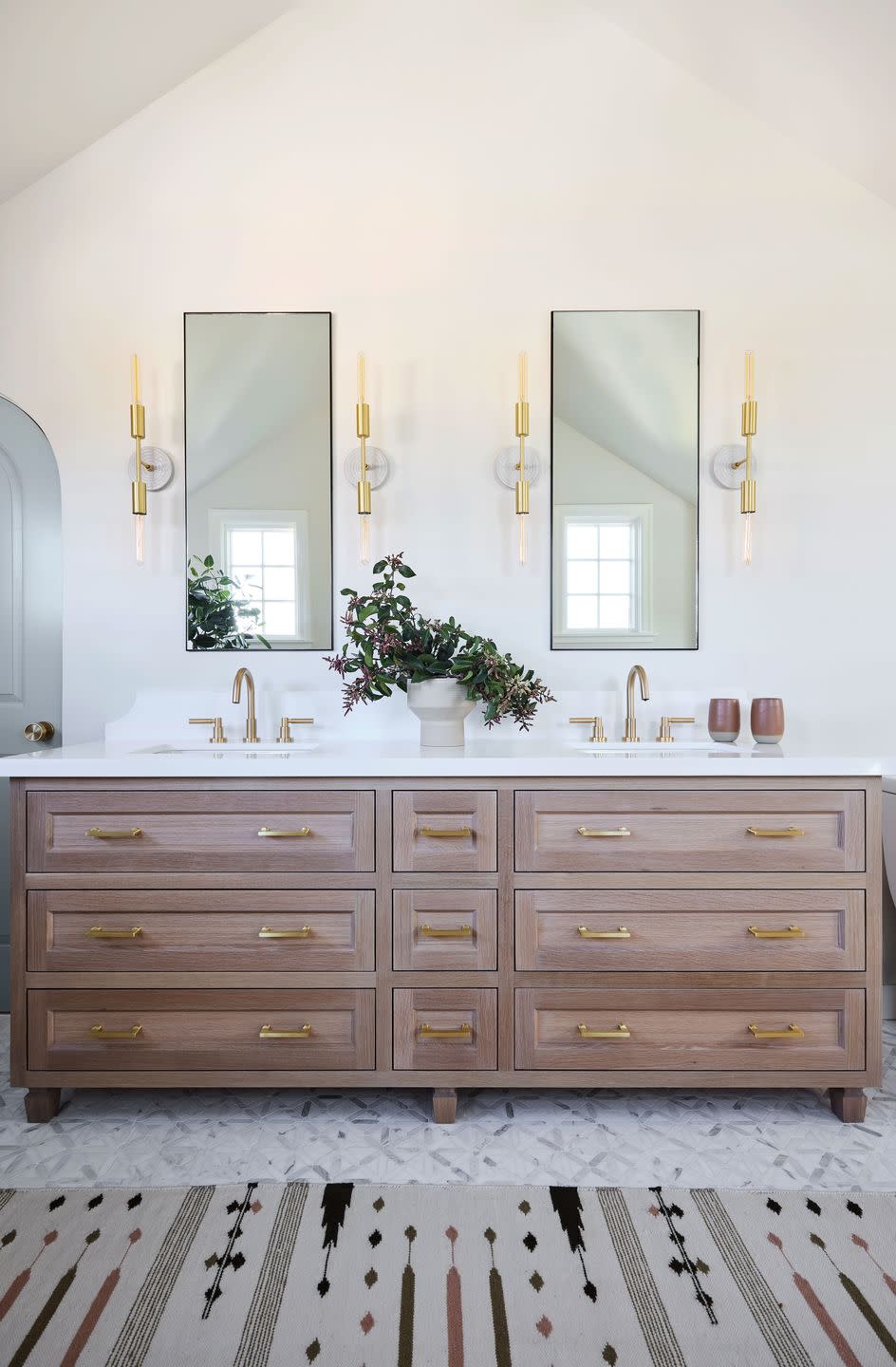
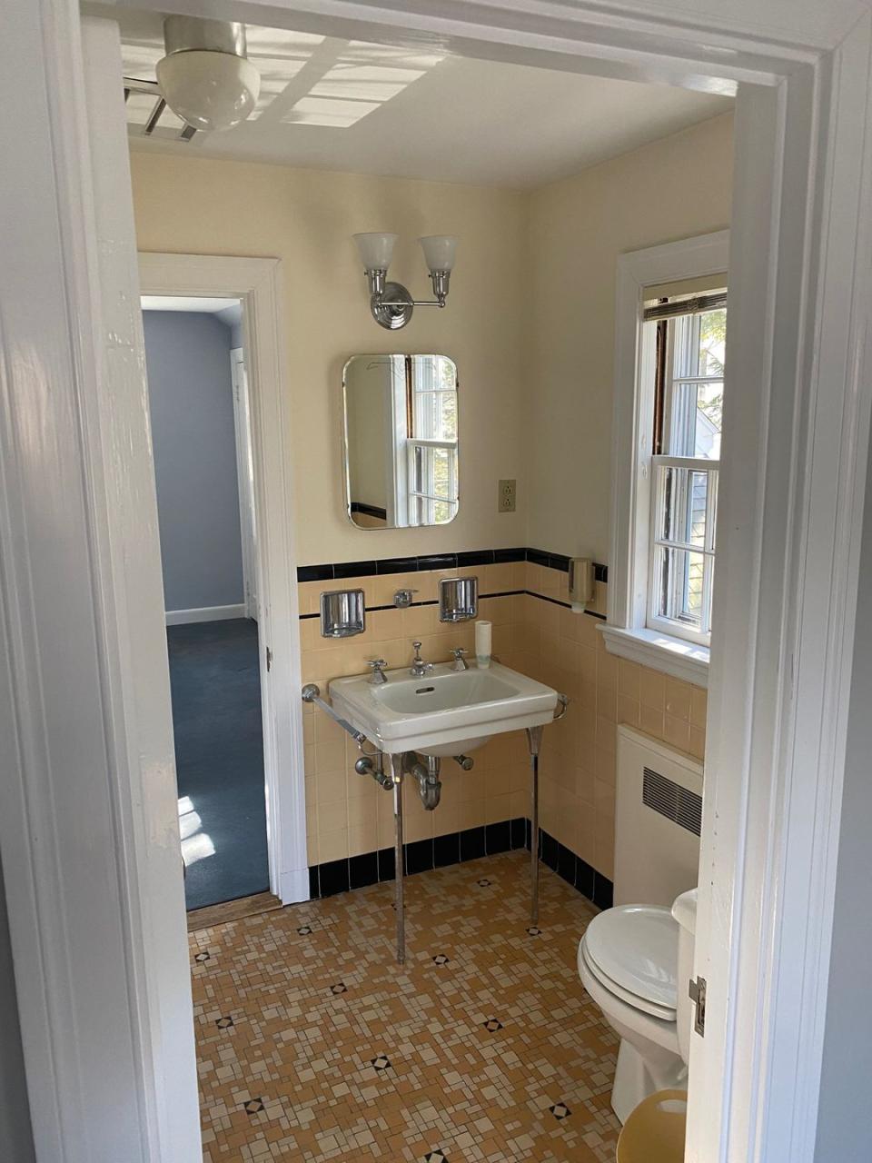
Before: Single Sink
One of the main eyesores of this outmoded bath is the dated sink, which features no storage space.
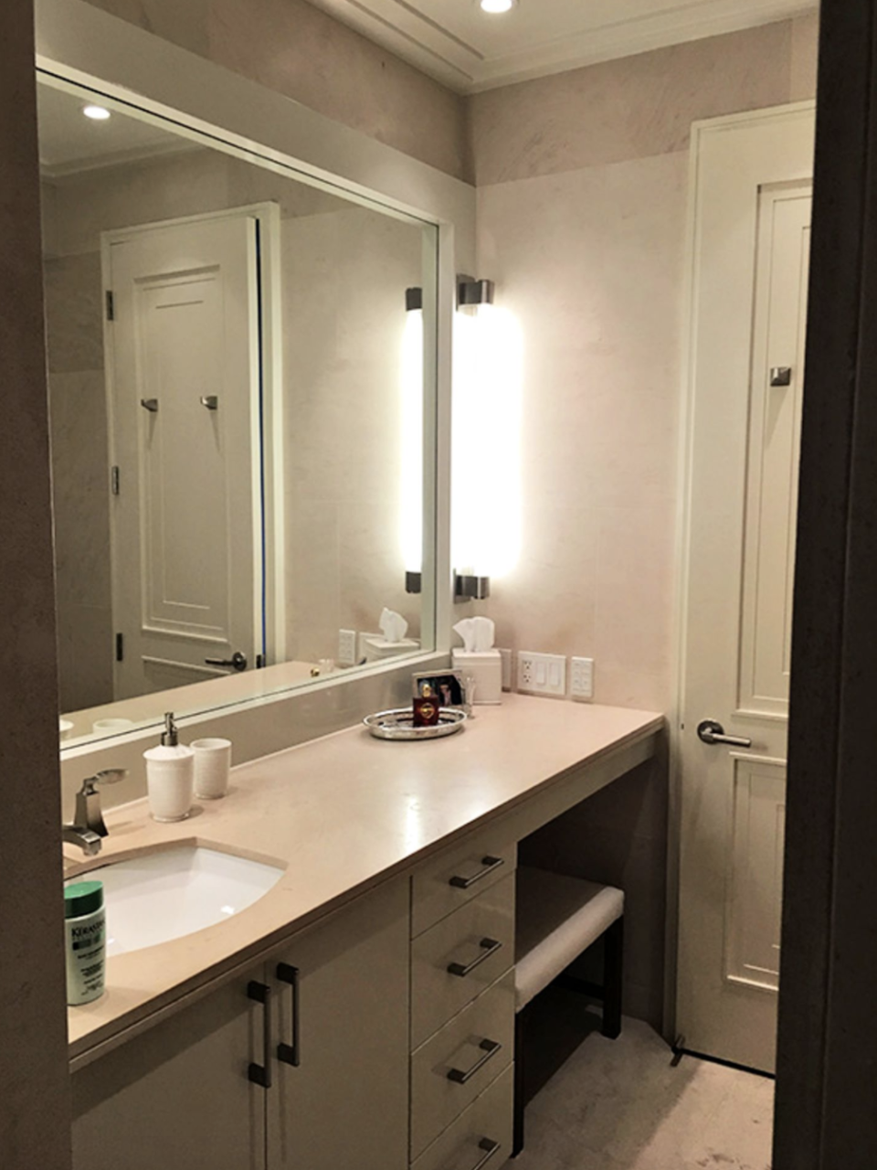
After: Double Vanity
Emily Kates Design gave the antiquated room a serious update with a double vanity replete with ample drawers and matching mirrors.
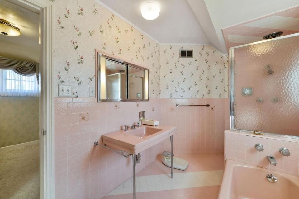
Before: Warm Tones
Dirty cream paint and sickly pink and brown tiling lend this bath its antiquated look.
After: Cool Tones
Erin Gates Design freshened up the space with a muted mint hue and a bright white vanity coupled with marble accents and matching floor tiles.

Before: Flooring
The floors in this bathroom are hardly a show-stopper, which made them the perfect candidate for a stunning makeover.
After: Flooring
The super plain tiles that previously graced the floors of this bathroom were replaced with smaller black, white, and gray tiles that form a tiny hexagon pattern. The switch–in a bathroom designed by Dabito, the founder and creative director of Old Brand New–makes such a big difference!
Before: Vanity
This bathroom had one big mirror and one sink in it, but there's plenty of space for a second sink and even more storage.
After: Double Vanity
Designer Summer Thorton turned a dark, cramped space into this bright area with maximum storage. The double vanity features ample cabinet room for stowing all toiletries and freeing up counter space.

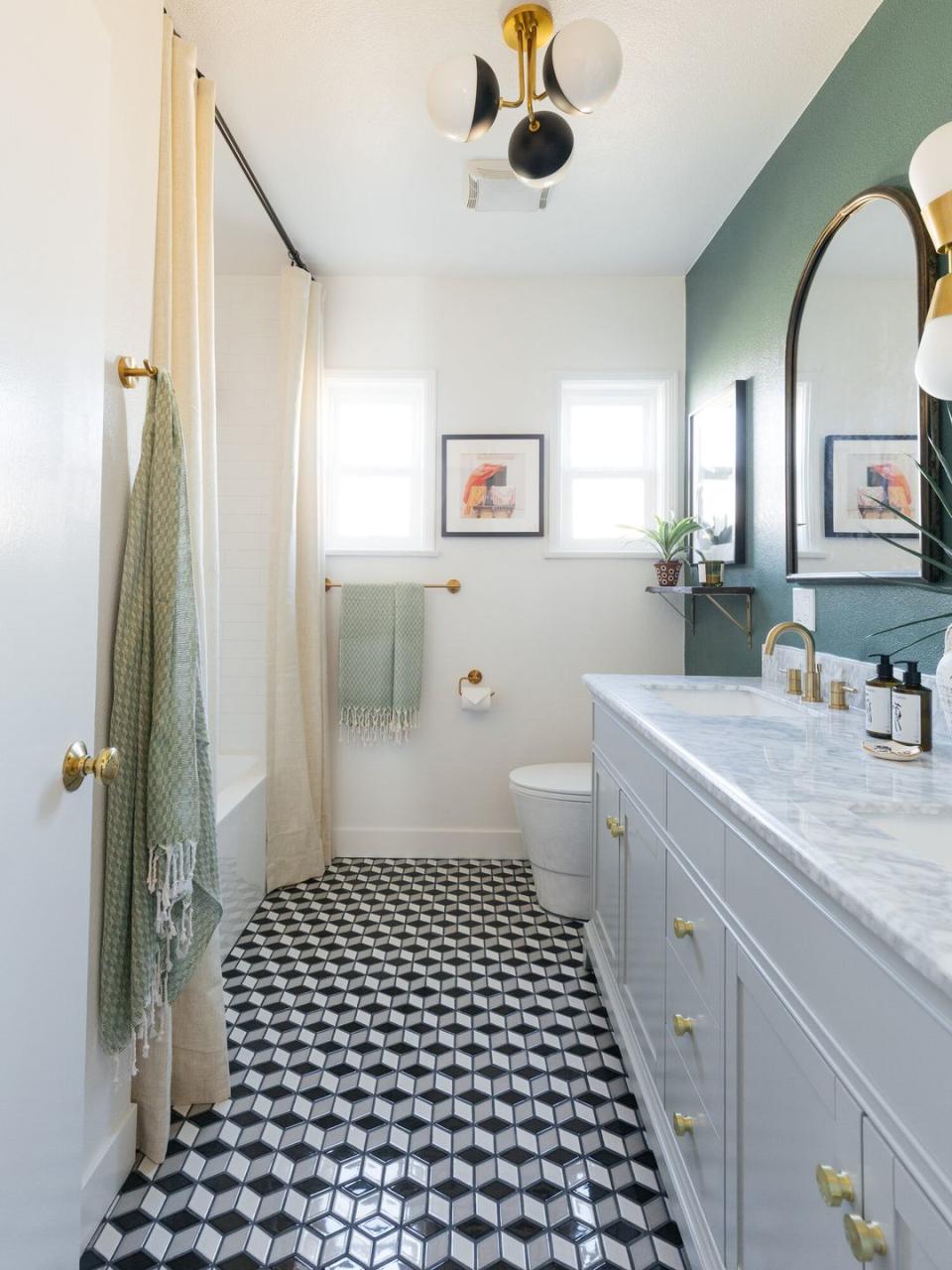
Before: Tiling
The basic, white square tiles on the walls of this bathroom scream drab. Imagine the personality you could replace those with!
After: Tiling
Designer Courtney McLeod of Right Meets Left Interior Design turned a boring tile concept into a this gorgeous, eye-catching work of art. The colors are fairly subtle with black, white, grays, and greens, but the pattern really makes it stand out.
Before: Shower Shape
Sure, you could go with a basic rectangular shower look, but what's the fun in that? Thinking beyond that framework will add an enticing element to your overall bathroom design.

After: Shower Shape
This shower, by Old Brand New, is framed by a yellow archway which gives a pop of color and sections the shower off to protect the rest of the space from steam.

Before: All White
A simple white bathroom could come off chic, but this tiny bath comes off boring and sad. A white space is the perfect canvas to get creative with color and pattern.
After: Pattern
Even covering half of the walls in a gorgeous, fun wallpaper will make the space look way more inviting. Designer Emily Henderson gave this bath a beautiful touch of blue foliage along with a fresh mirror and under-the-sink storage.

Before: Built-In Shelving
Cabinet space under the sink is often essential, but there are other ways you can make the most of your space without a honking vanity.

After: Built-In Shelving
In this bathroom, designer Justina Blakeney added an arched niche not only as a nod to the Spanish architecture of the rest of the home but for extra space to store cute plants and toiletries.
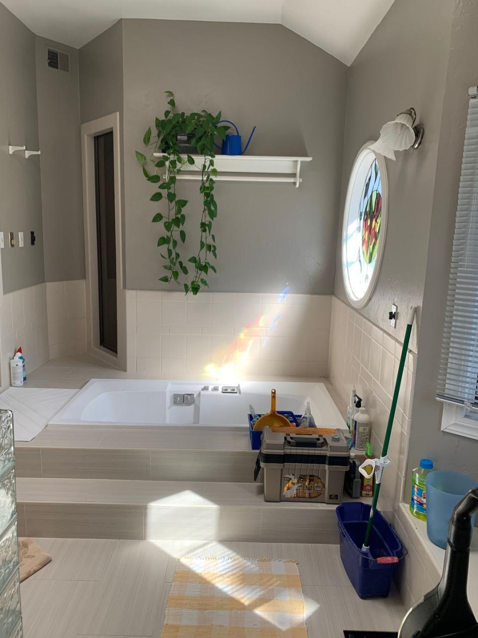
Before: Bathtub
A tub surrounded by a tiled area can easily eat up space in a bathroom. Plus, it gives the room a more outdated look that's void of any wow-factor.
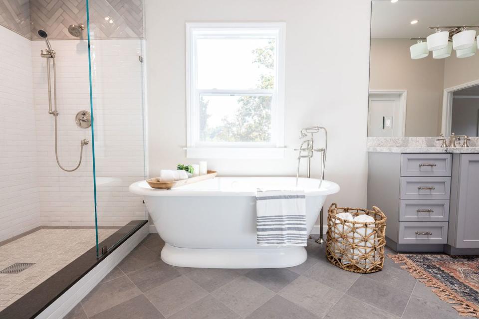
After: Bathtub
Emily Henderson Design removed a chunky tub and replaced it with a sleek, freestanding one in this bathroom. The crisp, white tub with gold accents screams total relaxation.

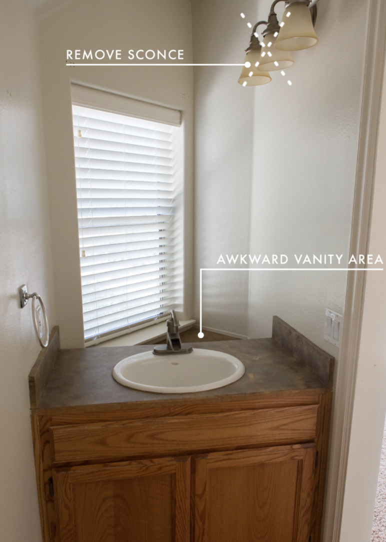
Before: Countertop
Apart from the awkwardly spaced vanity area and oddly placed sconce, this counter is a bit dreary. It definitely needed some love and revamping.
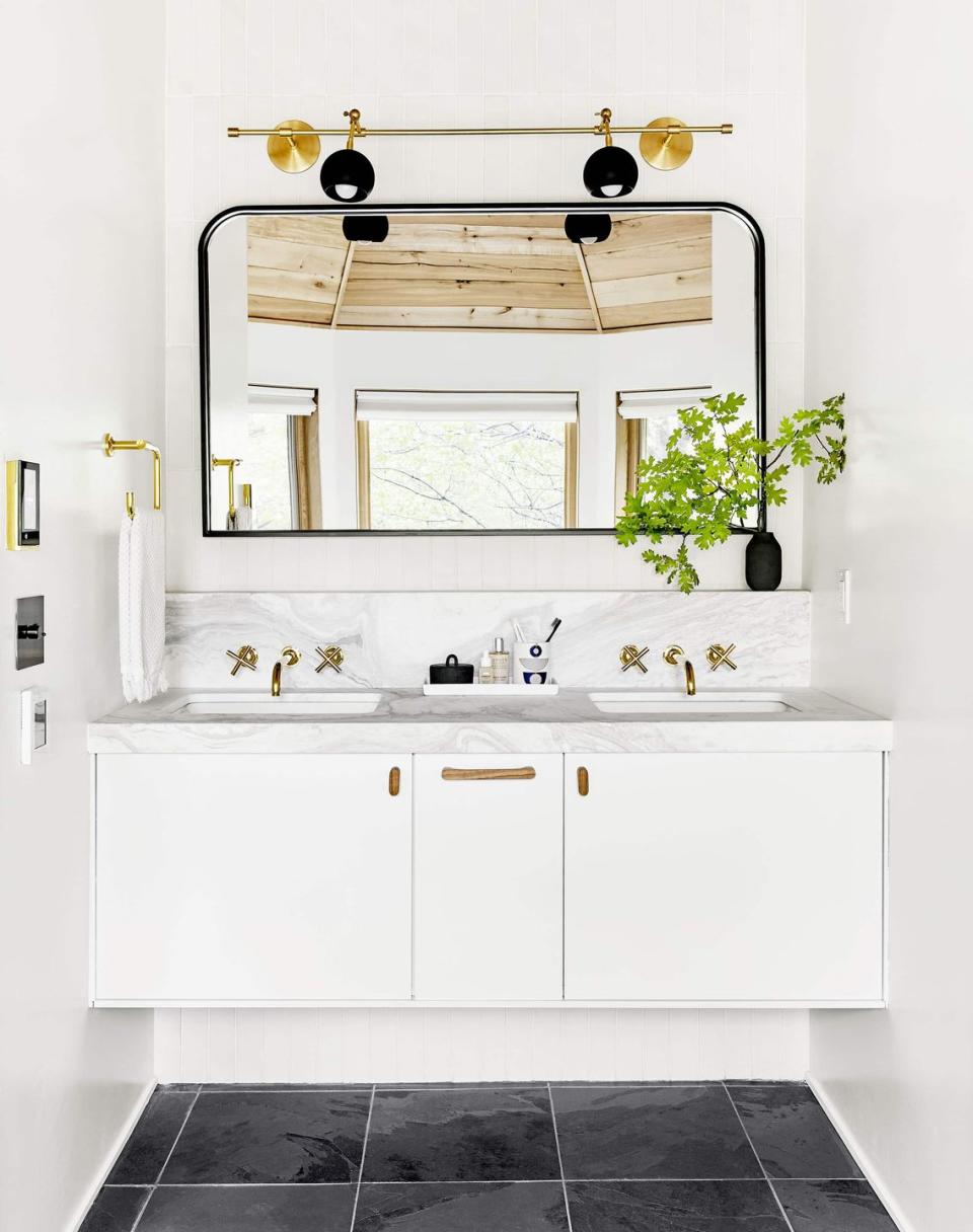
After: Countertop
Emily Henderson Design nixed the brown wood look for a modern one in this bathroom. The white marble counters paired with black and gold accents are incredibly chic.
Before: Mirror
The styleless mirror of this dull bathroom contributes little personality to the space.
After: Mirror
Evgenia Merson opted to replace the over-the-top full-wall piece with a chic, freeform mirror that lends the space a more sophisticated and modern vibe.

Before: Storage
The vanity in this bathroom doesn't exactly make your jaw drop. Plus, it has filler space underneath the cabinets that isn't really necessary.
Afer: Floating Storage
A slightly raised vanity will make the bathroom feel way more spacious, as it does in this space by Old Brand New. You could leave it empty or put steps for kids or larger items underneath it.

You Might Also Like

